

A standard business card tells people who you are. A card with the right specialty finish tells people you pay attention to detail before they’ve even read a word. In a world where most contact details end up saved on a phone within seconds, a card that’s genuinely satisfying to hold is one of the few pieces of print that people actually keep, show to colleagues, or pin to a corkboard. We get asked constantly which finish is “the best,” and the honest answer is that it depends on your brand, your budget and what you want someone to feel the moment they pick your card up. Here’s how each option actually looks, feels and performs.
Foiling brings the shine
Foiling applies a thin layer of metallic or coloured film to your design, gold, silver, rose gold, copper and a range of other colours are all on the table, along with holographic and patterned foils for something more unusual. It catches the light and adds a genuine sense of quality, which is why it’s such a popular treatment for logos, initials or a business name rather than large blocks of text.
Foiling works best against darker or richer background colours, like navy velvet or deep charcoal, where the metallic contrast really stands out and does most of the visual work. On lighter backgrounds the effect is more subtle, so it pays to think about your overall colour palette before locking in a foil colour. It’s a natural fit for jewellers, hospitality venues, beauty and wellness brands, and any business chasing a premium, high-end feel, but it can work just as well for a tradesperson or consultant who wants their card to feel a cut above the standard offering, provided it’s used with a light touch rather than covering the whole card.

Embossing is the quieter, tactile option
Embossing physically raises part of the design off the card surface, creating an effect you can feel with your fingertip as well as see with your eyes. This guide to specialty print finishes has some good side-by-side comparisons if you want to see how it differs from debossing and spot UV. It’s subtler than foiling in most cases, it works with the existing ink colour rather than introducing a new one, which makes it a lovely choice if you’re after a tactile, understated finish rather than something shiny or attention-grabbing.
Because embossing relies on pressure rather than colour, it tends to suit clean, simple logos and typography more than intricate, detailed artwork, which can lose definition when raised. It also pairs beautifully with a thicker card stock, since a heavier base gives the embossed detail more presence and durability. Embossing and foiling can be layered together as well, giving you a raised element that’s also metallic, a combination that reads as genuinely premium without being loud about it.
Spot UV adds contrast without adding colour
Spot UV lays a glossy, raised varnish over specific parts of the design, creating contrast against a matte background without introducing a new colour at all. It’s an effective way to highlight a logo, a border, a pattern or even a subtle background texture while keeping the rest of the card matte and understated. Because it doesn’t add pigment, spot UV tends to look most striking on darker matte stocks, where the gloss catches light against a flat, non-reflective surface.
Where foiling adds shine and colour together, spot UV adds shine and texture on their own — and the two can be combined for a genuinely striking result, with a foiled logo picked out further by a spot UV highlight around its edges. It’s also one of the more budget-friendly specialty finishes, since it doesn’t require the same material cost as foil film, which makes it a good entry point if you want to experiment with specialty finishing without committing to a bigger spend straight away.
SCODIX and velvet stock push things further
SCODIX is a digital enhancement process that builds up textured, raised print, and it can mimic, and combine, foiling, spot UV and embossing effects with more design flexibility than traditional finishing allows, since it’s produced digitally rather than through physical dies and plates. That flexibility makes it a strong option for shorter runs or designs with fine detail that would be difficult to achieve with conventional foiling or embossing equipment.
Velvet stock, meanwhile, is a soft-touch laminated paper that feels almost like fabric under your fingers. It’s become a favourite for brands wanting a genuinely luxe, tactile card, especially when it’s paired with gold or foil detailing that stands out beautifully against the deep, matte surface. Velvet stock alone, without any additional finishing, already feels like a step up from a standard card, which is part of why it’s popular with businesses in jewellery, real estate, hospitality and other image-conscious industries.
Think about how the card will travel, not just how it looks on day one
A finish that looks stunning fresh off the press also needs to hold up to real-world handling — sliding in and out of a wallet, sitting in a pocket through a work day, or being passed between several people at an event. Foiled and embossed elements are generally quite durable since they’re bonded or pressed into the stock itself, but very fine, intricate foil detail can be more prone to showing wear over time than a bolder, simpler shape. If your card is likely to get a lot of handling, say, at trade shows or in a retail environment, it’s worth favouring simpler foil or emboss shapes over delicate, thin linework, both for durability and because fine detail tends to get lost at business card scale regardless of the finishing technique.
Colour choice interacts with finishing more than people expect, too. A gold foil on white stock reads as classic and slightly formal, while the same gold foil on a deep navy or black velvet stock reads as considerably more dramatic and modern. Silver and rose gold behave similarly, shifting in tone depending on what they’re sitting against, so it’s worth testing a couple of stock and foil combinations rather than assuming the first pairing you picture will look the way you expect once it’s actually printed.
Choosing between them comes down to feel
Start with how your brand wants to come across, rather than which finish you’ve seen used elsewhere. Bold and lustrous points toward foiling. Understated and tactile points toward embossing or velvet stock. Clean, with a single highlighted detail, points toward spot UV. Complex or fine detail that needs flexibility points toward SCODIX. It’s also worth considering your industry and your customers: a finish that feels perfectly on-brand for a boutique or hospitality venue might feel slightly out of place for a tradesperson or a not-for-profit, so match the finish to the impression you’re genuinely trying to make rather than to what looks impressive in a portfolio.
From there, it’s a matter of budget and lead time, since specialty finishes generally take longer to produce than a standard print run and involve an additional production step or two. If you’re working toward a launch date or an event, it’s worth factoring that extra time in early rather than discovering it at the last minute. Our advice is always the same regardless of which finish you’re leaning toward: order a small sample run before committing to a large quantity, so you can see and hold the finish in the exact stock and colour you’re planning to use, rather than judging it from a photo or a generic sample that isn’t quite your design.
Combining finishes without overdoing it
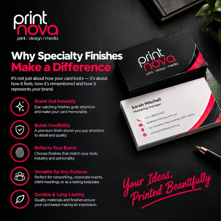
One thing worth keeping in mind across all of these options is restraint. A card doesn’t need every finish available to make an impression, in fact, the opposite is usually true. A single well-placed foil logo, or one spot UV highlight on an otherwise clean matte card, tends to land far better than a card trying to showcase three or four techniques at once. Specialty finishing works because it draws attention to something specific; spread across the whole card, that focus disappears and the effect can start to look busy rather than premium. If you’re not sure where to draw the line, our graphic design team is happy to talk through a few options and show you how a single finish, used well, can carry the whole design. The same finishing techniques work just as well on other corporate printing pieces, from presentation folders to invitations, if you want a consistent premium feel across more than just your cards.
We keep physical samples of foiling, embossing, spot UV and velvet stock on hand at our Warners Bay office, so you can see and feel the difference before you decide rather than guessing from a screen.
Ready to explore your options? Visit Printnova to see our full range of finishing techniques, request a quote, or get in touch with our team to book a look at our sample range.